Showing posts with label Mark Jegede. Show all posts

Thursday, 31 January 2013

This year has consist of allot of ups and downs, I have made a few friends especially from the group I worked with in terms of production of my music video. I would like to thank all the members of my group for the excellent teamwork each of them individually contributed to the group fairly.


  Wordle: Untitled

my overall reflection


My research,planning and evaluation  for my practical work  has improved tremendously compared to last year (AS), I found last year’s blogging especially more of a back-breaker  it was very difficult not in terms of the research but in terms of the different use of ICT to present it on such as the use of “Prezi” or even “slideshow”. My blog last year was plain and simple causing me to lose quiet allot of marks as I lacked technique (I did not take any risks). However now that I am in my second year I am more cautious wise with the techniques that I employ to make a great blog. The amount of blogs I delivered onto blogger has increased by twice as much compared to last year. Last year I was only able to do up to 3 blogs a weak, maybe because I was not really comfortable with my surroundings (still new to the college system). 

As of A2 I am able to use final cut pro for the actual practical coursework and match the markers with an actual song which was very useful for me in terms of production of my music video. It works by holding the “M” button, once the video is uploaded on the screen then drag down the marker onto the timeline and do this process repetitively but instead of me not putting the markers on the timeline which I found difficult last year for the making of our thrillers I find it much easier. My blogging personally is really coming along, I was much more confident when it comes to researching on the genres of our music video compared to last year. I was more consistent when it came to  the blogging entries as I blog daily. My blog posting stands currently at 140 which is really good, but it's not only quantity that matters my content of each blog was really good as well .

(Prezi was one form of technology I used to get my meaning towards the audience ).


However if i was able to do this again there is still room for improvement in terms of the use of ICT, this year I used a variety but most of them were prezi and wordle. I tend to blog in essay format I need to blog using a range of style that will be appealing towards the examiner. 


Wednesday, 30 January 2013

Evaluation Question 3


There are a range of technologies that I have exploited over the construction of my products (ancillary texts and music video) as well as within the stages of research, planning and evaluation, for example during the construction of my the consturction ic vieo) on, for exaple  proucts  music video we had to use final cut pro in order for our music video to have that really strong effect towards our target audience, this was done by one of the members of my group (fahmida).
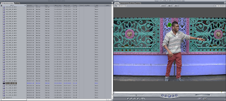
Marking the lyrics of the actual song to the artist we were recording was quiet difficult in the sense we really had to make sure that our recording artist looked like he is the one that is actually singing but it really was time-consuming. We actually used a range of effects from filters to slow motions, I could honestly say that the slow motion effect was perfectly executed in terms of bringing the music video to life because it tells a story towards the audience for example at the beginning of our music video notice that the slow motion we employed starts from his back and then zooms onto his feet making it have a bit of a narration effect through the body language of the artist.

Another technology that I employed during the course of the construction of my digipak and advertisement was called “Photoshop and quark”; I used different packages for the ancillary work in terms of editing pictures and creating text. I got 
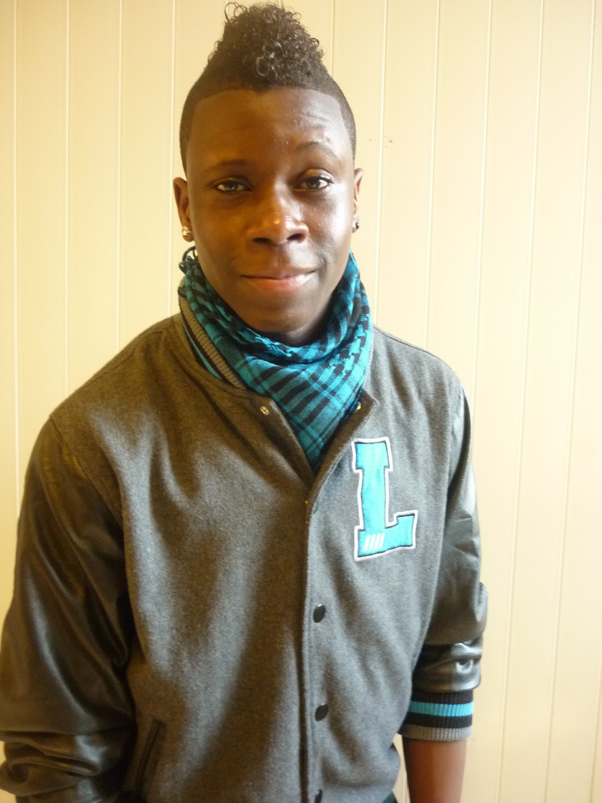
most of my images (in fact) all from blogger as we took pictures of the artist already and uploaded it here, from there I then decided to open Photoshop and upload the picture here before I then started editing my chosen image by adding a couple of filters and cropping the image as well, our teacher gave us a little advice that we should never stretch the images because it makes it look less appealing towards our target audience. This was quiet difficult to avoid seeing that I had to cover my whole page on screen  and the image that I choose was too small.


I used quark mostly for the advertisement in the sense that the advertisement required more text than the digipak as a result quark was my best solution because it had all the fonts, sizes and text boxes I need in order to get my avert done.
The internet came in handy for most of the research purposes because all my research required the internet; websites like YouTube were I got most of the music videos in order to describe theories like Goodwin’s amplification, illustration and disjuncture and also videos to help with my ideas in terms of the style, editing and camera work that I think will suit my group when it comes to production of our main product. I also use a website called “Dafont.com” this really helped me in choosing the sort of font to use for my digipak and advertisement. The digipak and advertisement that I have created have visual links in terms of fonts as well as size and colour.

Here is an example of the type of fonts that were available on the website


My group also made a storyboard in order to help us with the type of shots we are going to use, this was really useful because it meant that when it came to production of the main product (music video) we weren’t thinking on our feet of the type of shots we were going to use, hence we started and finished production much earlier.


I used blogger for all my ideas, everything that I have done in terms of A2 media coursework  has been uploaded onto the blog despite it being a very long process(blogging my ideas) it has been a very effective way of communicating with my group. The way I used this was pretty straight forward any idea that came to mind that I thought was really good I will create a rough copy on word than paste it onto the” create new” tab an fill the page with my ideas then press publish and done. However sometime it doesn’t publish my work at all because one of my evaluation questions went missing twice in one day, but overall blogger is a very reliable source of technology.
These are just a couple of examples of the way i used prezi on blogger
Here below is me using camtasia showing the posts i have done and the way i used blogger to present it on. These blogs that i have shown are my favourite posts in terms of content i have allot to talk about also the use of technology contribute to making it my favourite. 

Wednesday, 23 January 2013

Evaluation Question 2


There are many things that influenced my ideas especially for the location Eminem "beautiful" , the location that is in this music video is very dark as a result its difficult to see where the main base track is, but it seems to be in some sort of dark dingy building(looks quiet burnt and degraded)


I wanted my music video to consist of a dark background because it will bring the music video together in terms of appearance,thats why I decided to use a street and film at night because it has the same effect that Eminem has in terms of raising awareness and questions towards the audience.

Tuesday, 22 January 2013

continuation of question one

There are a substantial amount of music videos that influence our final decision on our chosen music video “Alex Clare Too Close”. The group’s decisions were mostly influenced by elements such as editing. We wanted to find a video that uses good editing techniques from jump cuts to reverse shots etc, and found Coldplay “paradise” to be at the top of the list as this music video exploits a range of editing techniques to engage the audience to an extent


coldplay- paradise 


This was the 1st music video that influence our final choice because it used a range of editing for example at the ending of the film we notice the artist actual performance, him and his band dancing to the crowd just letting the music takeover them, now we could adapt this to our remake of Alex Clare “too close” because at the end of our remake we could show the actual artist singing as well as dancing or doing something that’s entertaining instead of just showing the actors acting out a scene(that’s pretty boring) . This would be very good for filling in the base tracks of our remake especially at the end ,if we look at cold -play “Paradise “they used a range of base tracks some of them we only tend to see an elephant riding a bike.


Another influence was the mise en scene of a music video. Mise en scene is the expressions used to describe the design aspects of theatre production and film. We chose 3 main types of settings an exterior setting of a dingy bedroom to emphasise the confused and the numb state of emotions of the artist. The other two setting were a colourful street and the Islington cannel (still don’t know why we chose this, still a working progress). There are many music videos that employed a really good setting that has influence our choice and will influence our production of the music video itself. Ed Sheeran- Lego House.


Ed Sheeran- Lego House really influence our setting because it was in a cramped apartment that emphasised the artist feelings as being almost trapped and difficult to express. We could adapt this to our remake of “too close” by having a setting of a dingy bedroom with the artist sort of exploring his surroundings in a more negative way (clearly the actor wants to forget about his past and move on) the camera shots should be a medium shot to get the body language from the waist and above and a close-ups to see the facial expressions of the character.


Florence and machine- “shake it out “had a range of camera shots that influence our final deacons on the camera use


At the beginning of Florence and machine “shake it out” they used a range of shots, shots that are difficult to do but as we are A2 students we should have enough knowledge and skill to execute it. In the beginning of this music video they used close-ups of a women’s face to emphasise the emotions that she is going through accompanied with a slow motion of her going down a set of stairs. We could adapt this to our music remake as in the beginning we could have the camera show different parts of the artist face such as the eyes which is then faded by editing to the mouth followed by hands holding a picture of a happy couple or a passport.


continuation of question 1 comparing ancillary work

Here below is the comparisons of the codes and conventions of my digipak and advertsiemnt to real media forms.

Evaluation Question one

The Evaluation 1

Monday, 21 January 2013

Mark's Ancillary Final


Here below is my final Digipak and advertisement, it took a long time to get this done but in the end with all the hard work i was able to pull through tough times.
Outside and Back panel.

Inside panel.

Magazine Ad.

Friday, 11 January 2013

Feelings towards deadline.

The deadline for us to finish our digipak is on Thursday 17th and I am panicking like crazy, if I hadn't been lazy and not bothered to do the work I would have been finished by now.  Here is a list of words below that best describe the way I’m feeling.

Wordle: Untitled

Wednesday, 9 January 2013

Review of targets set


The last targets that I made on the 1st of January 2013 were the following
    
  1.  I should attend media workshops in order to get digipak and magazine ad don
        2.  use  all lunch times wisely(not just hang about)
        3.  stay positive(cant think when am annoyed)
        4.  have a minimum of 130 posts (or more)

Clearly I have got passed 130 posts but have not made any use of ICT and the media workshops at lunch time , maybe that’s why I haven’t already finished my Digipak and advertisement.  So I have decided to set new targets.
          1.   Finished digipak and advertisement in workshops
          2.   Have more than 140 posts 
          3.   Stay positive

Thursday, 3 January 2013

Alex Clare vs. Marcus Green


The comparison 


Alex Clare 


Marcus Green 

The song that my group has chosen is called “Too close” by Alex Clare. This song already like most songs has an original video that complemented the singing of Alex Clare, clearly because this song already had a video, we had to come up with something different, something better than the original music video itself. Alex Clare is a very sophisticated artist in the music industry due to the various styles of smart attire that he employs when performing on stage and on set for his music video. The name of our made up artist is called “Marcus Green” , we wanted to make a similarity in terms of taste and swagger, as a result we wanted Marcus green to only be seen in clothing that seems smart and sophisticated to some extent ( chinos and a cardigan) this new artist will capture the audience attention because of his unique hair style( Jerry curled Mohawk) because our target audience is quite young we tend to associate the young as having a variety of looks in terms of hair style and clothing.


 Alex Clare begins his music video sitting down on a chair in some derelict apartment with a range of close- ups zooming in onto different part of his face, our music video will start off with the artist walking on a dark street (so it’s at night time) with the camera showing his back then following his feet (close-up/ pan) whilst walking along the street before the first verse hits. Even the ending of our music video shows the artist opening a door and leaving his house with a suitcase. Alex Clare’s ending shows him as the artist singing “so ill be on my way” whilst the camera pans away from him eventually leading to an establishing shot. The main difference of both videos is that our main base track is set in a dark street whilst the original is set in a room filled with unwanted items and broken cupboards. 


Wednesday, 2 January 2013

The effectiveness that my digipak should contain.


I want my digipak to contain a range of elements that will contribute to creating an effective digipak/advertisement piece, my digipak will be influenced by many artists that have used close-ups for their album cover, artists like

Usher
50 cent 
Although these front album covers above do not link with the front cover that I will do in terms of genre they are just an example of a really effective digipak in the sense that it’s able to capture the audience’s attention and we are able to see the artist’s face and their emotions as well.  

I feel that it is really important(crucial) to employ close-ups for the front album cover, because it’s a new artist, no one knows who the hell Marcus green is and by having a front cover that does not consist of a close-up is a tragic. The use of close-ups is shown throughout our music video and will be used in the ancillary product as well, it is very important that I do this properly as I want to show a clear visual link as most of the shots are close-ups and medium shots one of them will be on the front cover of my digipak as well as advertisement.

Hopefully if done right the digipak and advertisement should complement each other in an effective way as they share similar shots, our music video’s main base track consist with a dark background (street at night) as a result of this my front cover should consist of a background that is dark as well as a result emphasizing the clear visual link between the ancillary products and music video. 

Tuesday, 1 January 2013

New Years targets (2013)

London 2013 new years fireworks display

OK, so its new years day (1st of Jan) and there are still quite a number of targets that I would like to set for myself this year in terms of the digipak and magazine ad, towards the ending of last year I was just not in the mood to do any work (a bit frustrating) maybe because it was the almost holiday season (truth be told I am not good at using quark nor Photoshop). This year I am hoping to achieve a number of things especially because this month is the most significant in terms of blogging, once January is over we can’t blog anymore so I am setting 4 targets they are 

               1.    I should attend media workshops in order to get digipak and magazine ad done
                    2.   Use all lunch times wisely(not just hang about)
                   3. Stay positive(cant think when am annoyed)
               4.   Have a minimum of 130 posts (or more)

Sunday, 30 December 2012

photo-shoot pictures

Internet difficulties/technical problems


Internet fixed and ready
Finally I am back, and back with a vengeance after several waits, anticipation and anger due to the fact that my internet was down as it suffered from a virus, meant that I was not able post my ideas about the digipak and more daily as a result you will notice from the number of posts I have done, the last time I made a post was on 21st of December, today is new years eve (clearly it’s been a while). Now that I am able to access the internet I will continue what I do best which is blog!

Friday, 21 December 2012

Color Scheme

It’s really important that as a group we choose the right color scheme because it helps promote the artist’s album well; this album is all to do with sadness and the ups and downs that occur in a relationship. I was thinking that we go for a darkie background (black or gray) because most of the songs are depressing.
Once the color gray gets closer to black, the more dramatic and mysterious it becomes. The color gray is subdued, quiet and reserved. It does not stimulate or energize despite one of the tracks for our song consisting with quiet allot of energy from the artist himself. 


Gray can stifle and bring this depressed energy but it is also the stable base from which the new and positive can come.


Black is more of a color that keeps things bottled up inside, hidden from the world such as the emotions of the artist it creates a barrier between itself and the outside world, providing comfort while protecting its emotions and feelings, and hiding its vulnerabilities, insecurities and lack of self confidence( according to Wikipedia).


Black can give an impression of authority and power towards our target audience.

These two colors are indeed very effective and will look very good on our digipak but then again this is just my opinion.

Thursday, 20 December 2012

my magazine mock up


Here below is a mock up of a page of a magazine of Marcus Green, this was quite challenging  at first in the sense that in today's media lesson i did not get anything done partly because i was not concentrating but as i stayed in for lunch i was able to get the work done.  Now the image that i have chosen is clearly a closeup of Marcus Green,closeups are important especially for new artists  despite it showing little background it emphasizes the artist as  it shows the audience the personality of  the him/her through facial expressions. I used the  images from blogger then uploaded and edited them using Photoshop  but the text was done on quark as Photoshop was more difficult in terms of positioning the text.

Double click to make it big screen